Better Elevators
During a visit to Principal Ziliu, a team member expressed confusion about the use of elevators: do the up and down buttons at the elevator door indicate the direction the passengers want to go, or do they control the direction the elevator should go? For example, when you are on the first floor and want to go to a higher floor, should you press "up" to indicate you want to go to a higher floor, or press "down" to call the elevator that is currently on a higher floor down?
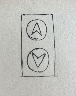
At that time, I thought it was ridiculous to remotely operate the elevator like a directional button; the team member just lacked experience using elevators.
Later, when I visited my cousin in Hong Kong, I found myself at a loss standing on the first floor of the Lincoln Building because it had no up and down buttons. I stood there for a long time until I saw how others used the elevator: at the entrance of this elevator area, there was a numeric keypad where you needed to press the floor you wanted to go to, and then wait for the system to assign you the fastest elevator to come down to the first floor.
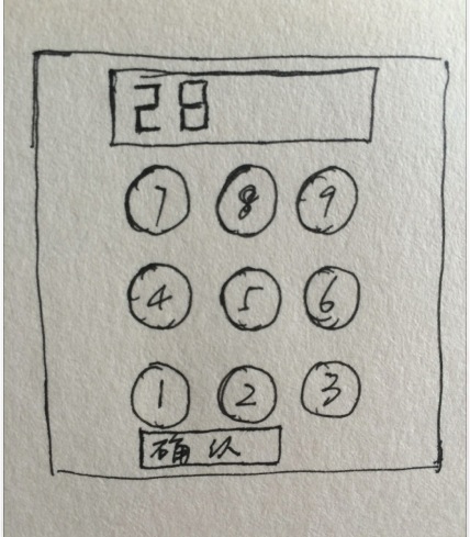
This type of elevator has two advantages:
- It eliminates the confusion for first-time users regarding the up and down buttons;
- It meets safety requirements, allowing only access from the first floor to higher floors or from other floors down to the first floor.
However, it has the following disadvantages:
- It goes against the habits developed by long-time elevator users;
- Its operation method is not straightforward enough.
Later, my cousin told me that how to improve this elevator could be a question in their interviews. While it was a joke about the elevator's oddities, it made me realize that the elevators we currently use do have some issues:
- First-time users may be confused by the up and down buttons;
- Even experienced users may face the problem of everyone rushing to press their desired floor once inside the elevator;
- The operation area is at hand, while the feedback area is above (which is the practice of most elevators).
So I sketched out an elevator design I would like:
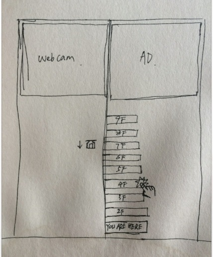
Of course, my drawing is quite poor, and I hope you don't mind.
By placing the operation area directly on the elevator door, users can simply press the button for the floor they want to go to, eliminating the need to rush into the elevator to select a floor, thus avoiding the chaos that can ensue. One side of the door can display the floors available for selection, while the other side indicates which floor the elevator is currently on. After pressing the button for a floor, the button lights up or provides other appropriate feedback. This interface, where input and feedback are together, I believe is more user-friendly and reduces the burden of use.
Additionally, in this sketch, the operation area is positioned too low; the correct position should be ergonomically considered to ensure that as many people as possible can comfortably reach it.
Other areas of the elevator door can be used to display advertisements or show the status inside the elevator to prevent crime or disturbances around the elevator. Of course, these are not mandatory, or they could be placed elsewhere.
Once again, my drawing is quite poor, and I hope you don't mind.
What started as a plan for weekly updates has turned into monthly updates; I am quite impressed with myself. ( ´◔ ‸◔')